Issues with the Tesla Model 3
A while ago an article was published on an EV website along the lines of "Here's a list of all the things we don't like about the Model 3", and it was a blank article. It got traction and even Elon Musk replied to it, saying "It's blank?", before umpteen people pointed out the [poor] joke.
Anyway, I don't really like this whole fanboy thing acting like something is absolutely faultless. I've owned a Model 3 for a couple of months now and whilst it is AMAZING and by far the best car I've ever wanted to own or owned – it's not faultless. So, I wanted to write down, the mostly small things, that I've noticed could be improved. Again: I love this car! But nothing is perfect (even the world's roundest object is impressive, but not perfect) – there's always room for improvement.
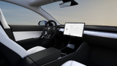
Model 3 interior with centre console (Image from Tesla Motors).
Centre console
This is going to be subjective, but - It's a little large. I would say this because one of my favourite things about the BMW i3 is the reduced size of the centre console - the floor in the front cabin runs from the passenger to drivers side and gives a really spacious feel. The Model 3 is perhaps a little over-generous with console storage but I guess this is going to be down to peoples taste. I'm less used to that tucked-in cockpit feeling which I think the centre consoles wall helps to create.
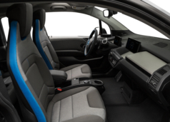
BMW i3 front cabin and centre console for comparison. Carpet runs from the driver's side to the passenger's side, providing enough space for a bag. You can also switch seats easily!
The front and rear storage compartments in the centre console could perhaps integrate some shared access, so that the 12V outlet could feed accessories located in the front more easily. It's also not really clear what the deep front storage well is really for. It's too pokey to stuff a jumper in there, it's too big for smaller things - I've found it's a space that attracts clutter as it's not really suitable for anything in particular. Other than maybe... a gear stick? It's handy storage but such ample storage in the centre feels almost like an ICE hangup. I'd love to see a version with a floor that ran flat from right to left, opening up the middle and adding to that minimalist feel.
Poor design of the closing latches
Lots of people talk about this. The centre console compartments have lids which are magnetic and push-to-open. If you're gentle with them, they are generally fine to use. But if you're not, or if you're new to them, or if you're just having one of those days - they are really awkward. Initially, I saw the problem and got used to the solution and thought "What is all the fuss about?". But over time I've come to realise that actually, the design isn't good enough.
When you push down to release the lid, there is a hinge mechanism that is pushed down and takes a short while to return to its position. It needs to be in its rested position in order for the lid to close. So, if you have a failed attempt to close, when you then try to close the lid gently, sometimes that hinge mechanism has not yet returned to its position. And if that happens, because it's magnetic, the lid isn't close enough to the hinge magnet, and it cannot be closed. The UI even alerts you to say "please close the lid gently", which to me only highlights the design issue more. This seems like a physical design problem to solve - it seems to me that if the hinge mechanism returned to its position faster, the risk of the lid being closed when the magnet isn't yet in position would be reduced and the problem lessened. But, this is just what I can gather from using it.
Navigation
I was really surprised to find that some of the functionality of the navigation tools are a little lacking. The map app itself is slick, fast and beautifully designed. But there are a couple of issues that immediately became apparent during the first drive, back from the service centre.
No multiple routes
When entering a destination, you are given a route to follow. There are no alternative routes and no way to choose to avoid motorways. I'm very used to being able to select alternative routes having used Google Maps for so long. Plus, coming from the BMW i3, I'm used to being able to choose alternative routes for optimum fuel efficiency. It was a real surprise to see no alternative route selection or waypoints in the Model 3 software. I strongly expect this is a planned feature.
Poor search for charging stations
This was again, very surprising. The maps app helpfully routes you to the nearest Supercharger for long journeys. Having used one recently for the first time, they are absolutely fantastic and the user experience of them completely blew away my previous experiences with other networks - the navigational tools and integration into the car only help further improve that experience. However, I don't live anywhere near a Supercharger (although there's been one stated as coming to Brighton since the end of 2017). I also don't have any off-street parking, so using public chargers is crucial. Searching on the maps app for chargers brings up some results, but data is ropey. My local charger was listed as being on a different road, many are unlisted and don't appear on the map at all - plus there's no way to view availability status (which is available through APIs). The BMW i3 displayed a much better set of data for chargers on its (far less capable) maps app. There's no way to search for just Rapid chargers either. Here I suppose there may be a little conflict of interest for Tesla, what with their own charging network, in promoting other networks. But then, that stance might also contradict their mission. I'd love to be able to easily search for and filter chargers regardless of charging network.
UI oddities
The UI is easy to use and once you are settled in to the car, you don't really need to use it that much when driving. Which is completely how it should be! I have noticed a few design choices, or perhaps things that have been overlooked.
Driving alerts
As you are driving the car there may be important events that the vehicle needs to alert you to. When Autopilot is engaged, it may be a reminder asking you to apply slight pressure to the steering wheel, or to take control, or that a camera has reduced vision.
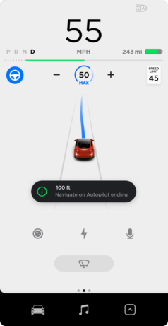
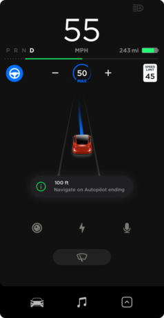
Autopilot alerts during the day (Image from Tesla Motors). And during the night - with no high contrast to make the alert clearer (Image is a representative mock-up of Autopilot alerts at night time).
During the day, these alerts are presented on a dark pill shape, over a white background. This high contrast makes them really easy to see out of the corner of your eye. However, at night time, the background remains dark only the background is now also dark - without the contrast, they stand out less which seems undesirable considering their importance. This makes them less obvious to see and it struck me as a bit odd that a higher contrast colour hasn't been chosen for the night time mode.
Inconsistency in menu button positions
The Model 3 UI is divided at the top level into two vertical columns. In the left-hand drive (LHD) Model 3, options and settings appear in the larger, second column on the right-hand side of the screen. Within that area, menu category options are on the left, meaning that category options can be easily selected, as they are presented closer to the driver.
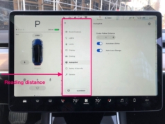
Location of the menus in the left-hand drive Model 3. Access to menu categories are presented closer to the driver, making them easier to access. (Image from TheDrive.com "Tesla Model 3: The First Serious Review").
However, on the right hand drive (RHD) Model 3, at the top level, the vertical columns are reversed, with the larger one found on the left. Within that, the menu layouts are actually the same as in the LHD UI. This means the category options are furthest away from the driver and it's a bit harder to select the category - it's harder to read and to select.
The same is true for the glovebox button. On LHD, this button is presented closer to the driver, but on RHD its presented closest to the glovebox. Both make sense in their own way.
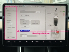
Location of the same menus in the RHD, (albeit a more up to date software version). Here, with the driver sat on the right-hand side, the menu category options are presented as far away as they could be, which makes selecting the menu categories harder. The glovebox button is also further away.
To me, these issues show inconsistency in the intended design (Fitt's Law springs to mind). Did the designer intend for the menu categories to be harder to select in the RHD? Or the Glovebox easier to open in the LHD Model? It seems like the two columns of content have simply been switched around for RHD, with less thought put in to the actual positioning of the content within them, and their relationship to the driver.
It could be argued that the content is still read from left to right, including the menu categories. But the reason I mention it is because I find the menu category options are one of the harder things to both read and select on the screen, which I think is the more important issue at hand.
Media
Without the Premium Connectivity (fingers crossed for subscriptions for that to start soon), the Standard Range plus doesn't come with Spotify or Internet Radio / TuneIn. Available media options are FM/DAB Radio or Bluetooth connectivity with your phone.
OK, so since writing this the v10 software has arrived (enabling Spotify and TuneIn via wifi hotspots), but it also came with free data connectivity for an unspecified, limited time. This is probably in advance of a subscription service for premium connectivity. But, right now, on paper, the Standard Range Plus doesn't come with the Premium Connectivity package. So, it doesn't come with Spotify or Internet Radio / TuneIn over the cars built-in internet connection. The available media options are FM/DAB Radio or Bluetooth connectivity from your phone.
Now, I totally accept that some people will regard this point null and void in the presence of connected services. But, I was really surprised to see that the Model 3 cannot browse media on an iPhone when connected via USB. Once an album is playing on the phone, you can pause, play, skip or replay a track easily using the UI and wheel controls. But you are restricted to playing only the current album. In order to select another album, you would need to use the phone itself (!).
I've owned two cars and both of them, the Mini Clubman D (2013) and the BMW i3 (2014) allow media on an iPhone connected via USB to be browsed, searched and loaded easily using the vehicles in-car media player. I was really surprised to see no support for this in the Model 3. With Premium Connectivity this functionality is no doubt less important, but right now I can't upgrade to that so it seems even more to be an omission. I know many owners lament not having Car Play but I couldn't care less about that.
No weird unit settings for the UK
File this under "localisation", but in the UK, we're half stuck in the past. All our road signs and speed limits are in miles. But anyone under 40 will have been taught centimetres and kilograms in school. So we're in this weird in-between situation, where ideally, units for speed and long distances would be in miles. But units for short distances, such as the parking sensors, would be in centimetres.
My proposal would be a "Stuck in the Past" setting, for UK users to address this. Or, a separation between distances & speeds and then another for all other units. I would say it's very specific for the UK, but I really don't know what other countries may live in strange in-between of imperial and metric.
No scheduled departure times
Continuing the i3 comparisons, the i3 let you schedule departure times, allowing the car to prepare the battery for use and precondition the interior. There's no such functionality on the Model 3, which was a little surprising. Although I didn't always use it when I did it was super handy, especially when the weather is cold.
Whilst writing this has been added in a firmware update. 🎉
Phantom drain
Having lived with an electric car for three years, I thought I knew most of the ins and outs of owning one. But "Phantom Drain" (battery discharge when not in use) is completely new to me. The i3 I owned had a ~18kWh usable battery. The manual warned that leaving the car for long periods would see the battery losing some range, especially in cold weather. But I never really noticed this to any large degree. In cold weather, the range dropped very fast, but I wouldn't get in the car each day and see the battery noticeably lower than when I left it. As the Model 3 has a larger battery I would have expected this to be even less of an issue.
However, the phantom drain is very noticeable on the Model 3. I'd noticed early on when on holiday that the sentry mode uses around a mile of range per hour when in use, fair enough - it's doing some seriously impressive security surveillance recording on 3 cameras with mobile app integration (an incredible feature). However, with this feature off, on one of the first cold snaps of the season (cold being around ~0ºC), it lost 15 miles overnight. Wow! I was not expecting that! Most nights I lose 3-4 miles, so 15 was a big shock. This would be way less of an issue if I could leave it plugged in overnight, but I can't regularly do this, and if I do it's on a public charger.
Perhaps Tesla's advanced battery management means that more energy is needed to keep the car in a ready-to-go condition at all times. But the amount it uses is quite surprising, and I'd love to see Tesla working to reduce phantom drain or even provide settings to optimise what is used when the car is idle. Out of everything, this is probably my biggest surprise with the vehicle and the biggest problem as I don't have home charging.
In summary
The Model 3 is an incredible car. I absolutely love it, there is no going back to "other" cars. This blog post is just about all negative points I can muster about the vehicle. The impressive thing is, that nearly all of these points could be addressed via a software update. In any other car, this could mean years of waiting before ultimately, disappointment. However, since owning the Model 3, it's already had an increase in range, plus it's had Netflix, YouTube, Spotify, TuneIn and Caraoke added (yes, Karaoke in a car, it's surprisingly fantastic) - all via free software updates. BMW wanted an annual fee for so many aspects of their connected service and none of them came close to the fun of Caraoke, or the new-normal of letting my Mum watch Designated Survivor on Netflix in the car whilst I got Fish & Chips.
Two of the items I wrote in this post have already been addressed via software updates since I started writing it. So I have every expectation that some of the issues I note may well improve over time.
Of course, if you're thinking about getting a Model 3, basically the best car ever, please help yourself to my Tesla referral code for 1000 free miles on Tesla Superchargers.